Developing new products
We're developing a new app here at Kaiser Permanente revolving around pregnancy and new borns. We worked with a vendor to help us out on the UX/UI design and development.
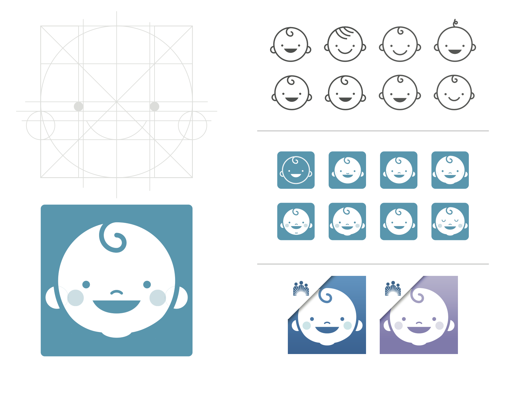
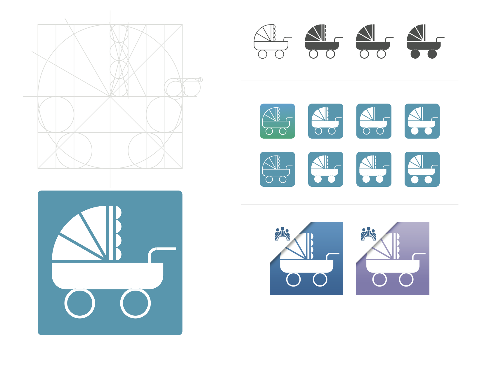
I was in charge of creating the app/website icon. By following KP's icon design guidelines this was the result.
Preliminary sketches
Some initial sketches with pen and paper before jumping on the computer.
Adhering to Brand Guidelines
Like people, brands have personality. The most important effect of our brand personality is that it makes us not just recognizable but knowable. And it's that familiarity that allows audiences to create lasting bonds with us.
Some of our personality traits include: friendly, caring, dedicated, expert, health activist.
A sampling of KP icons.
Icons
Icons help us cut to the chase. They allow our audiences to consume information quickly and easily. And in their simplicity, icons can help eliminate language and education barriers.
Some of the key characteristics of KP icon are: simple & functional, even line weight & cohesive appearance, read well at small sizes, universal appeal / usable by diverse groups.
Final Vector
The final vectorized icon. We ended up using the baby icon.