ECG Interface
The challenge
Create a consumer app that will not only facilitate an ECG reading but show a history of results and motivate users.
Goals
App shouldn’t take any longer to record an ECG than other apps already on the market. Should be easy to understand and remove as much friction as possible to help build up a habit.
assumptions
App will get built in the near future
User is an adult
User doesn’t have any major disabilities (eg blindness)
User reads and understands English
ECG reader is a watch similar to the Apple Watch
User lives in an area where they have a stable internet connection
ECG reading can be taken at around the same time each day
ECG reading should be taken while relaxed and sitting
ECG reading should be taken everyday over the course of a month
Discovery
By looking at other product on the market, I started to understand some of the pain points users face today.


AliveCor
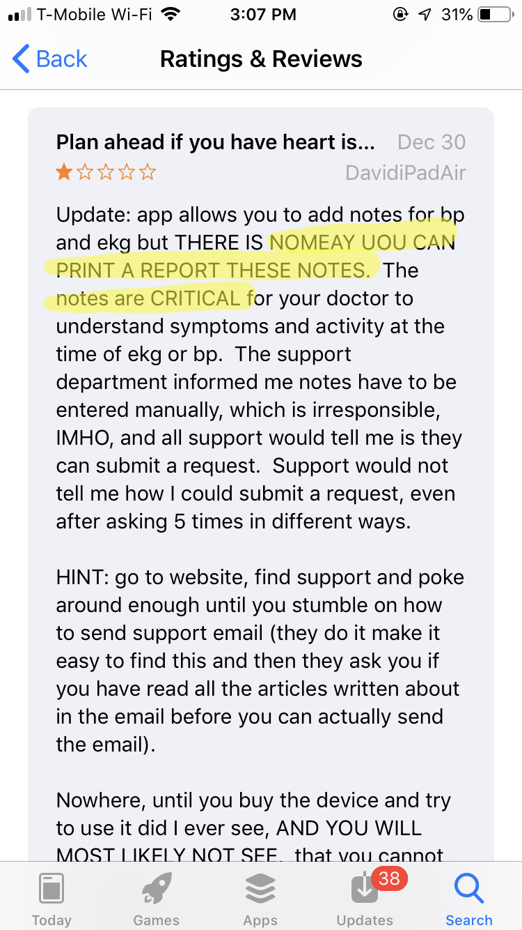
AliveCor is a company that specializes in consumer hardware that conducts EKG readings to detect Atrial Fibrillation. While I don’t have access to their users, I read through some reviews to better understand customer sentiment and areas for improvement. There were a few recurring themes that include:
users being scared due to false positives
no easy way to export and print all data
sensor not getting the right reading (eg due to environment)
Ideally, I would want to shadow users to see how they interact with this product (or similar products) in their natural environment.


apple
I used Amazon Mechanical Turk to quick survey 20 people to get an understanding of how users interpret Apple’s ECG results.
My hypothesis was that most people are not likely to know how to read the chart and may potentially scare users due to making assumptions on what healthy heart rhythm looks like. I also predicted that users aren’t likely to understand what the result of “sinus rhythm” means and whether they should worry or not worry. While it’s explained in the initial onboarding, I won’t expect a user to memorize that.
Here are some verbatim quotes when asked to interpret the sinus rhythm results:
““It looks not healthy like an irregular heartbeat. I think bad health.”
”I’m not very qualified to tell, but from what I can see it looks okay.”
”It means the rhythm has small spikes and not consistent, it means bad health””


analogous products
In addition to looking at products that have strong overlap (other ECG apps), I looked at apps that encourage frequent usage (Headspace on the left and Duolingo on the right).
Both products incorporate gamification elements.


Sketching
After some initial investigation, I jotted down some ideas ranging from goal setting to streaks to videos from their actual cardiologist.
One thing I knew I wanted to ensure I did was create data hierarchy. Once the reading is complete, the initial result should tell the user in easy to understand language whether their results are considered normal or not. If I user feels that’s sufficient, they can exit the app. If not, the user should be able to easy dig deeper and view charts and more detailed information.
User journey
Very high level journey of a potential user. Ideally the patient will diligently take ECG readings over the course of a month and visit a cardiologist after a month to review the results.
UI FLow
Ideally, I would like to do user testing to see if users can efficiently get through certain tasks.
Nudging
The idea of nudging someone to take action isn’t new both in and out of the mobile app space. The problem I find with both myself and those around me are that these nudges don’t occur at an ideal time.
I will often set a timer to remind myself to do a certain task at a very specific time: eg — an alarm to remind myself to meditate at 7:30 am everyday. If I’m in the middle of brushing my teeth at the time, I’ll shut the reminder off and forget all about it by the time I’ve left the bathroom.
Rather than forcing the user to work on the very exacting time schedule of an app, let’s build context around what the user is doing and interrupt them when it actually makes sense.
With that in mind, here’s a detailed view:
Hi-fidelity
Here’s a higher fidelity version of one screen along with the start of some redlines and greenlines.
